The 2022 Pantone Colour of The Year has the home design industry very excited.
Very Peri, a periwinkle shade of blue, was chosen as this year’s winner by the world’s leading expert on colour.
PANTONE 17-3938 Very Peri is a stark contrast to the 2021 choice PANTONE 17-5104 Ultimate Gray and PANTONE 13-0647 Illuminating, a blend of soft grey and bright yellow tones.
Very Peri offers a more subdued and calming feel at a time when people are looking for ways to decompress when exploring their home decor.
“Very Peri is very pretty! I can’t tell you how happy this makes me, the shade of blue-violet has always been one of my ultimate favourite colours,” says Kare Design franchise owner Edilka Anderson. “I love the thought process and the description for this year’s Pantone colour.”
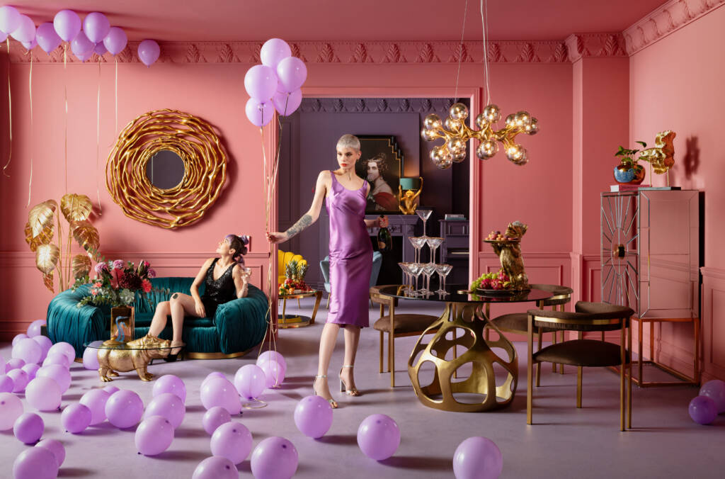
In recent years, dark rich colours have become the staple of designers who wanted to move away from the beige and white influences of minimalism. Very Peri still allows homeowners to enjoy a softer, more muted colour that works well with both clean and maximalist looks.

Anderson says she is happy to see colour grace the palettes of home design again. She notes Very Peri offers vibrance and energy that people have been missing over the past two years.
We all need to bring more colour in our lives and the combination of the periwinkle blue, which is a calming tone, with the violet-red tone creates a vibrant colour, which evokes creativity,” she says. “We have been through so much in the last couple of years, and this colour would bring more joy and positivity in our lives.”
She says Kare Design is not afraid of colour and that Very Peri has already infused their latest mood photos and marketing materials.
“We love to inspire our customers, and give them ideas on how to stay creative and wild! Very Peri will be stunning as an accent wall, or used in decor pieces throughout your space.”
At the Pantone Colour of the Year announcement, Pantone Colour Institute Vice President Laurie Pressman said Very Peri represents more than just a colour but takes a stronger place among global culture.
The Institute defines Very Peri as displaying a spritely, joyous attitude and dynamic presence that encourages courageous creativity and imaginative expression.
“The Pantone Colour of the Year reflects what is taking place in our global culture, expressing what people are looking for that colour can hope to answer,” Pressman says. “Creating a new colour for the first time in the history of our Pantone Colour of the Year educational colour program reflects the global innovation and transformation taking place.”
She says as a society it is important to recognize the role that colour plays in our lives from a personal and communication level.
“As society continues to recognize colour as a critical form of communication, and a way to express and affect ideas and emotions and engage and connect, the complexity of this new red-violet infused blue hue highlights the expansive possibilities that lay before us”.
At Terra Firma Design, the possibilities are endless. Owner Lisa Aiken says Very Peri is an exciting addition to modern design.
“Very Peri is a beautiful, multi-dimensional colour, highlighting blues, purples, and pinks. The perfect accent colour for the white room where you can create a sophisticated, elegant space by using it for accent cushions, upholstery, or rugs,” she says adding it is easily incorporated into home decor through more than just accent pieces.
She notes Very Peri is a beautiful colour on walls, furniture and encourages homeowners to embrace the design possibilities.
“If you can paint a piece of furniture with Very Peri, it will be striking next to the white walls. You can also use Very Peri on walls, it is dramatic, yet peaceful,” she says.
Aiken recommends pairing Very Peri with jewel tones for the accessory aspects. She says it beautifully works with colours such as greens, plums, turquoise blues, and neutrals.
“The light in your room will determine which colour tone to add to it so they compliment each other. Woods love this background light or dark,” she says. “Don’t forget your exterior too!”